This document provides examples of how to create choropleth maps of
Mexican municipios using the mxmaps package. The examples
showcase various customizations, such as using continuous and
categorical data, zooming into specific regions, removing municipio
borders, and adding labels to the map.
Continuous Color Scale
The following example demonstrates how to create a choropleth map of all Mexican municipios with a continuous color scale. The map shows the percentage of the population that speaks an indigenous language.
library(mxmaps)
library(viridis)
library(scales)

df_mxmunicipio_2020$value <-  df_mxmunicipio_2020$indigenous_language /
  df_mxmunicipio_2020$pop
gg = MXMunicipioChoropleth$new(df_mxmunicipio_2020)
gg$title <- "Percentage of the population that speaks\nan indigenous language"
gg$set_num_colors(1)
gg$ggplot_scale <- scale_fill_viridis("percent",
                                      labels = percent)
gg$render()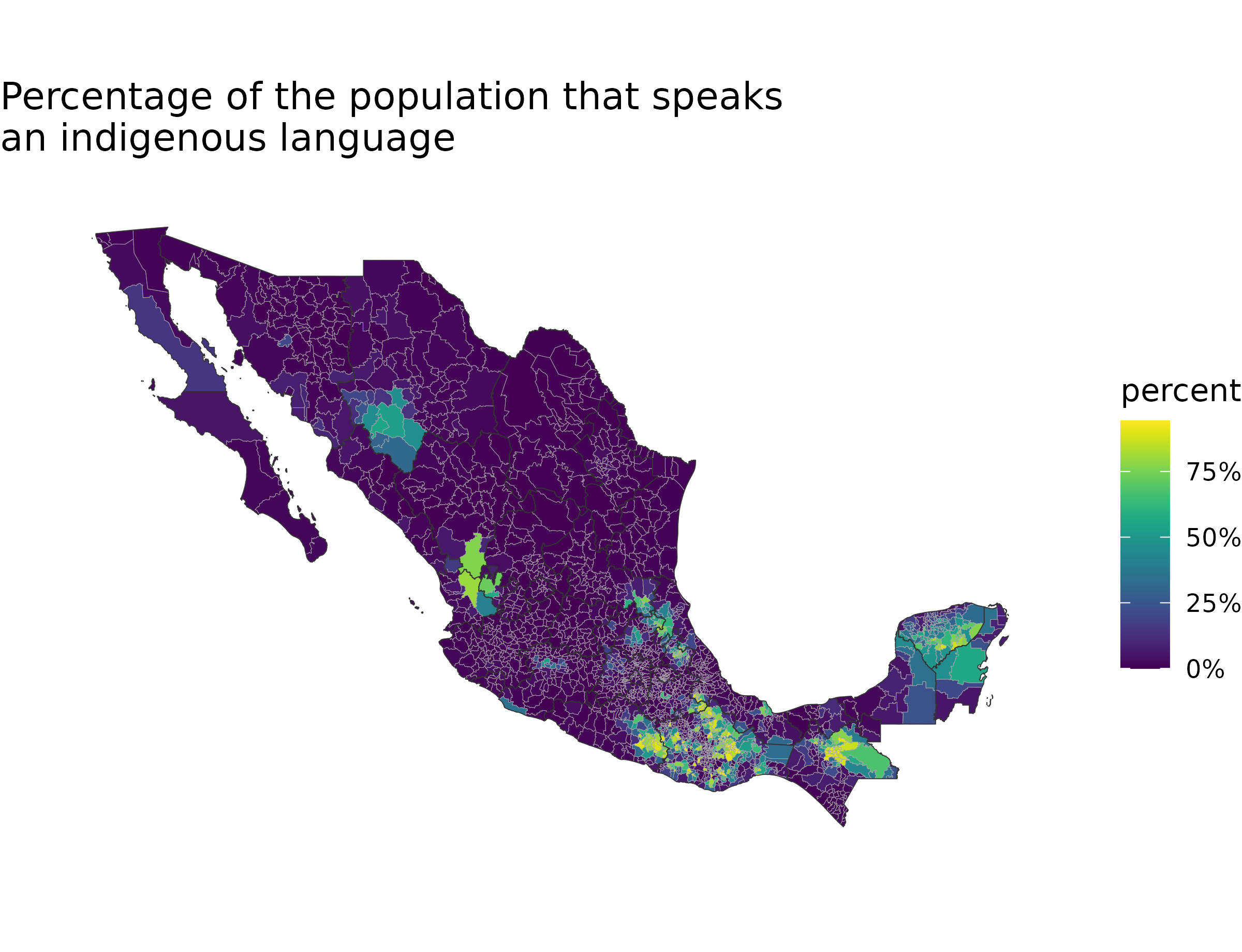
Categorical Data and Zooming
This example shows how to create a map with categorical data. The map
is zoomed in to show only the municipios in the states of Mexico and
Mexico City. The theme_void() function is used to create a
clean layout without axes or gridlines.
library("ggplot2")

df_mxmunicipio_2020$value <- as.factor(sample(c(NA, letters[1:6]),
                                              nrow(df_mxmunicipio_2020),
                                              replace = TRUE) )
gg = MXMunicipioChoropleth$new(df_mxmunicipio_2020)
gg$title <- "Municipios a-f"
gg$set_num_colors(6)
gg$set_zoom(subset(df_mxmunicipio_2020, state_name %in% c("Ciudad de México",
                                                          "México"))$region)
gg$ggplot_scale <- scale_fill_brewer("type", type = "qual", palette = 2,
                                     na.value = "gray")
p <- gg$render()
p + theme_void()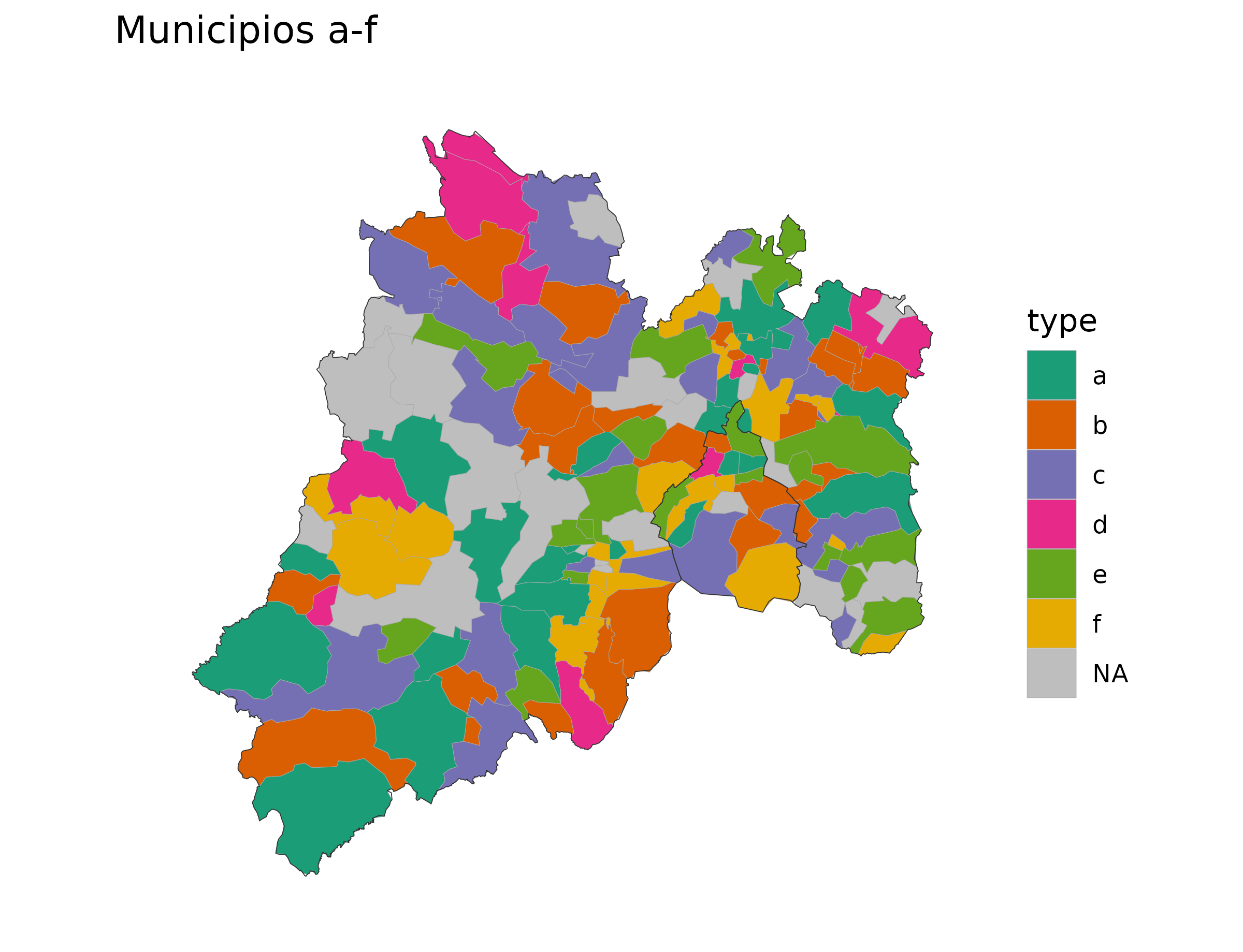
Removing Municipio Borders
The mxmunicipio_choropleth function returns a
ggplot object, which can be further customized. In this
example, the borders of the municipios are removed by directly modifying
the ggplot object.
library("scales")

df_mxmunicipio_2020$value <-  df_mxmunicipio_2020$afromexican /
  df_mxmunicipio_2020$pop
p <- mxmunicipio_choropleth(df_mxmunicipio_2020,
                            title = "Percentage of population that identifies as Afromexican",
                            legend = "percent\nAfromexican",
                            num_colors = 1)
p[["layers"]][[1]][["aes_params"]][["colour"]] <- "transparent"
p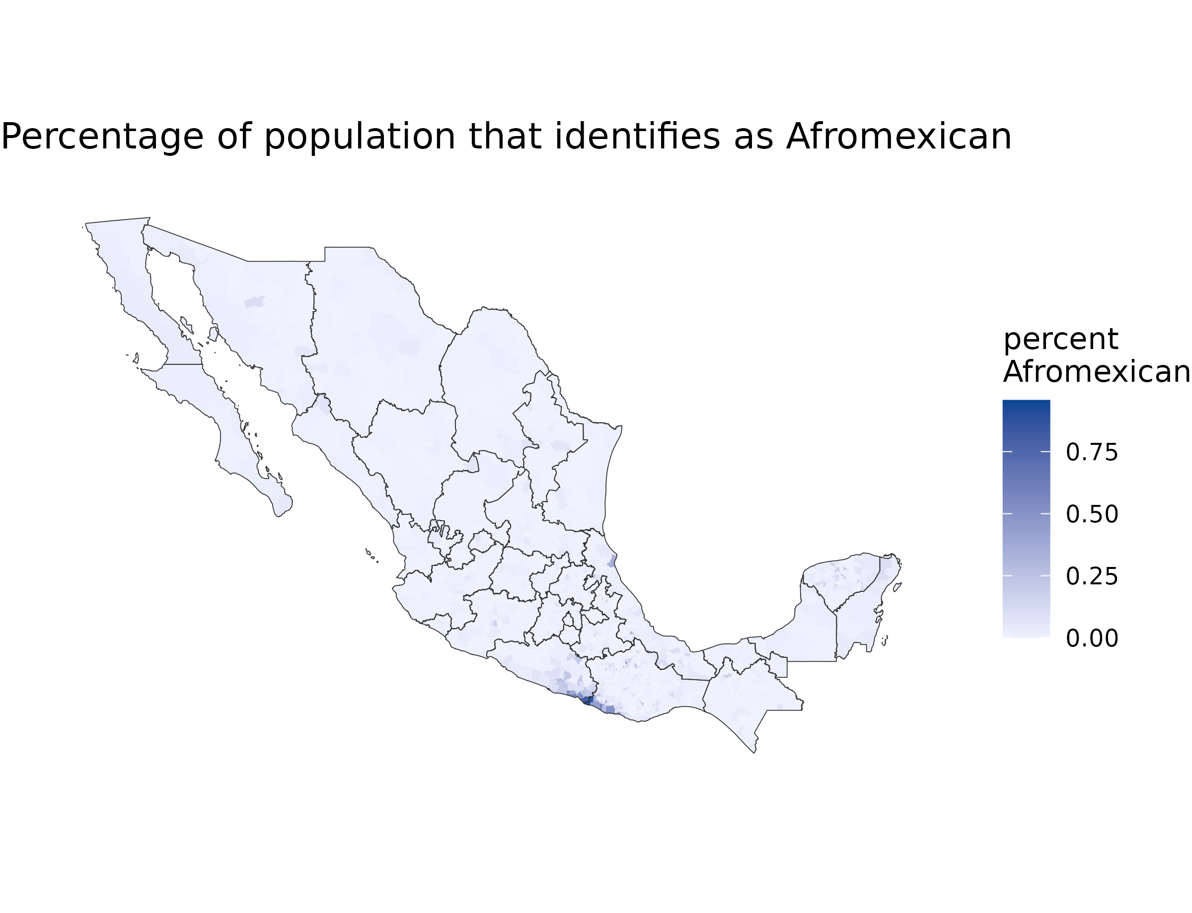
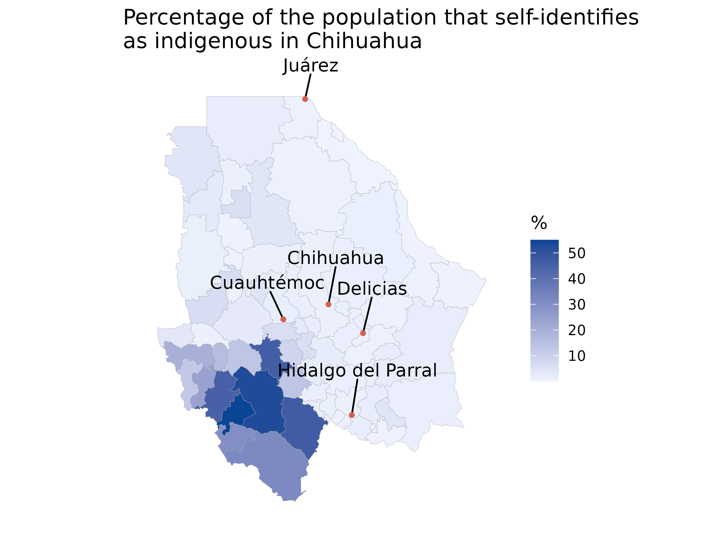
Adding Labels to the Map
This example demonstrates how to add labels to the map to identify
important municipios. The map is zoomed in to the state of Chihuahua,
and labels are added for all municipios with a population greater than
100,000. The ggrepel package is used to prevent the labels
from overlapping.
library("ggrepel")

df_mxmunicipio_2020$value <-  df_mxmunicipio_2020$indigenous_language /
  df_mxmunicipio_2020$pop * 100
chih <- subset(df_mxmunicipio_2020, state_name %in% c("Chihuahua"))
p <- mxmunicipio_choropleth(df_mxmunicipio_2020, num_colors = 1,
                       zoom = chih$region,
                       title = "Percentage of the population that self-identifies\nas indigenous in Chihuahua",
                       show_states = FALSE,
                       legend = "%")

labels <- chih
labels$group <- NA
labels <- subset(labels, pop > 1e05)
p +
  geom_text_repel(data = labels,
                  aes(long, lat, label = municipio_name),
                  nudge_x = .1,
                  nudge_y = .7) +
  geom_point(data = labels,
             aes(long, lat),
             color = "#d6604d",
             size = 1)